Photo : Erik Mclean on Unsplash
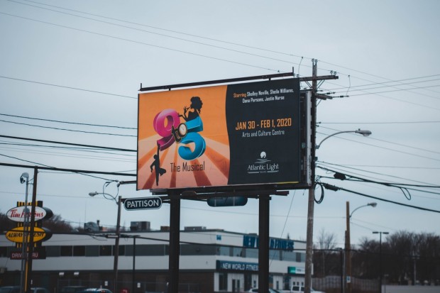
Billboards throughout history can be really interesting to look at and learn from, especially from a marketing perspective. Looking at the wild successes and heartbreaking flops from history can set us up for success, because then we'll know we should-- and shouldn't-- be doing in our advertising campaigns.
Chicago billboards are especially interesting, as the city is metropolitan and has a high population count. The information that can be gathered from studying Chicago billboards, in particular, can tell us stories and deliver data about how well particular tactics performed.
Additionally, by looking at historic trends with billboards, we can see what's changed and maybe even draw some conclusions as to why those changes took place. Every day, the marketing world is changing and out-of-house (OOH) marketing is doing its best to keep up with the best performing trends.
In some ways, Chicago billboards are likely ahead of the trends very often during history. This is likely because it's a hub filled with innovative thinkers and learners, many of whom grow up to join the wild world of marketing. This is where ideas are born and executed, then put to the test for success.
Chicago Billboards in the 2010s
In the 2010s, things were pretty different from the way they are now. Especially if your childhood was at least partially spent in this era, it's easy to look back on the trends and criticize them. But we do that mainly because we found ourselves to be so cringy.
The same fate might just befall Chicago billboards in the decade.
In the 2010s, it was extremely popular to be timely and to utilize call-to-action phrases. It was also very common to have massive, comic-style faces and heads plastered onto these billboards.
When the "OBEY" phrase rose to popularity, it's no wonder that bold and non-serifed fonts were also prominently featured in these advertisements. And that has worked so well that we generally tend to stay true to bold and simple fonts in the present as well.
However, the color palettes were also pretty muted, making use of lots of neutral colors and only relying on a few strokes of an accent color to bring the ad together.
Chicago Billboards in the 2000s
Conversely, 2000s Chicago billboards were very colorful and bright, experimenting much more with bold colors and experimental designs. Suddenly, some billboards were packed with pictures and faces, as well as a lot of text to read.
Rather than simple designs and clean lines, many billboard designers decided to get creative with different photographed textures, like woodgrains, leaves, and towering skylines. And while these were visually interesting, they certainly made it difficult to read the large amounts of text that probably didn't need to be there in the first place.
Especially in this era, billboards also liked to get political and spread big messages to the masses. Billboards were being used to spread anti-drug campaigns and spread the news about presidential elections.
Conversation on billboards could get so catty, that some fast-food restaurants would find less-than-subtle ways to poke fun at their competitors, making fun of food quality and more.
Chicago Billboards in the 1990s
Billboards in the '90s generally had a better understanding of how to utilize humor, with companies being able to poke fun at themselves.
However, these also focused on a different kind of design, focusing less on photos and more on cartoon-like images in order to get their messages across. Many of these would have intricate lines and shading, though it's possible that these added complexities made it more difficult to discern exactly what was being sold or what a company's message might have been.
Text on billboards was also much more likely to have decorative elements like serifs. In the present day, this kind of text can make us feel a little more nostalgic for the past. However, most marketers now know that this only makes the text more difficult to read. The only exception to this is when the decorative text is part of a readily recognized logo.
What are Good Billboard Tactics Today?
In terms of design, the history of Chicago billboards can certainly teach us a lot. For example, easy-to-read text without serifs has definitely withstood the test of time, stretching back decades of billboard advertisement in one way or another.
It's also taught us that simple designs are frequently better than complicated ones. For example, it may be best to not have 20 faces on a single billboard, and it's better to have solid backgrounds for easy reading.
And speaking of easy reading, it's definitely best to keep your billboard copy short and to-the-point, rather than explain every little detail when potential customers might be able to figure things out more quickly with properly descriptive images.
You only get so much time to read when you're driving past a billboard. Let your audience get stuck with a good feeling and a simple design, rather than straining their necks to try and read that last sentence.
* This is a contributed article and this content does not necessarily represent the views of universityherald.com
